
You’ve stood in front of that blank wall a hundred times. You know it needs something but every gallery wall you’ve tried on Pinterest ends up looking like a crooked mess of mismatched frames instead of the polished, magazine-worthy display you pinned it for.
Here’s the good news: the difference between a gallery wall that looks accidental and one that looks professionally styled almost never comes down to talent. It comes down to picking the right layout for your space, your frames, and your furniture and then following a few non-negotiable spacing rules.
That’s exactly what this guide gives you. Below are 14 living room gallery wall layout ideas, from the foolproof grid to the eclectic salon style, plus the spacing tricks, frame math, and placement rules that make each one work. Stick around for the layout at #7 it’s the one most beginners skip, and it’s the one that solves an awkward wall faster than any other option on this list.
Save this guide before you start hammering you’ll want to come back to it mid-project.
How to Choose the Right Gallery Wall Layout First
Before you fall in love with a layout, look at three things: your wall shape, your frame collection, and your room’s existing style. A narrow wall between two doorways needs a different approach than a wide, open expanse above a sectional. A collection of mismatched thrifted frames wants a different treatment than a matching set of black frames.
Here’s the thing: the best layout is the one that works with what you already have, not the one that looks best in someone else’s living room. Keep that in mind as you scroll then pick two or three favorites and test them before you commit.
1. The Grid Layout
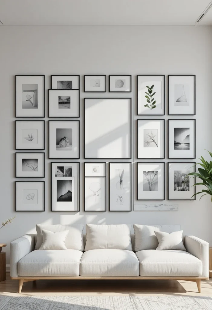
The grid is the most forgiving layout for beginners because it relies on repetition instead of intuition. Choose frames in identical (or nearly identical) sizes, space them 2–3 inches apart, and align them into rows and columns.
Why it works: The human eye reads repeated shapes as order, so even busy or colorful art looks calm and intentional once it’s locked into a grid.
- Best frame count: 6, 9, or 12 (even numbers keep the math simple)
- Best for: modern, minimalist, or Scandinavian-style living rooms
- Frame tip: Nine matching black frames evenly spaced above a sofa create an instant geometric focal point
[Pinnable image placement: a straight-on shot of a 3×3 black-frame grid above a neutral sofa, overlay text “The Grid Gallery Wall Formula”]
2. The Salon-Style Cluster
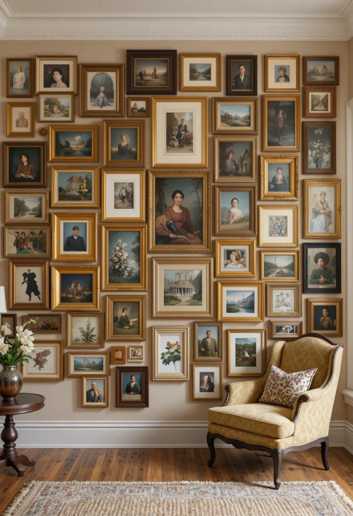
This is the maximalist, eclectic layout you’ve seen in old European drawing rooms frames of wildly different sizes, shapes, and eras layered edge to edge with almost no negative space between them.
Here’s the catch: salon style only works if there’s one unifying thread running through the chaos a color palette, a frame finish, or a subject matter. Without that thread, it just reads as clutter.
- Best for: eclectic, maximalist, or vintage-inspired living rooms
- Frame tip: Mix gold, black, and wood frames, but repeat each finish at least twice so your eye has an anchor to return to
3. The Staircase (Diagonal) Layout
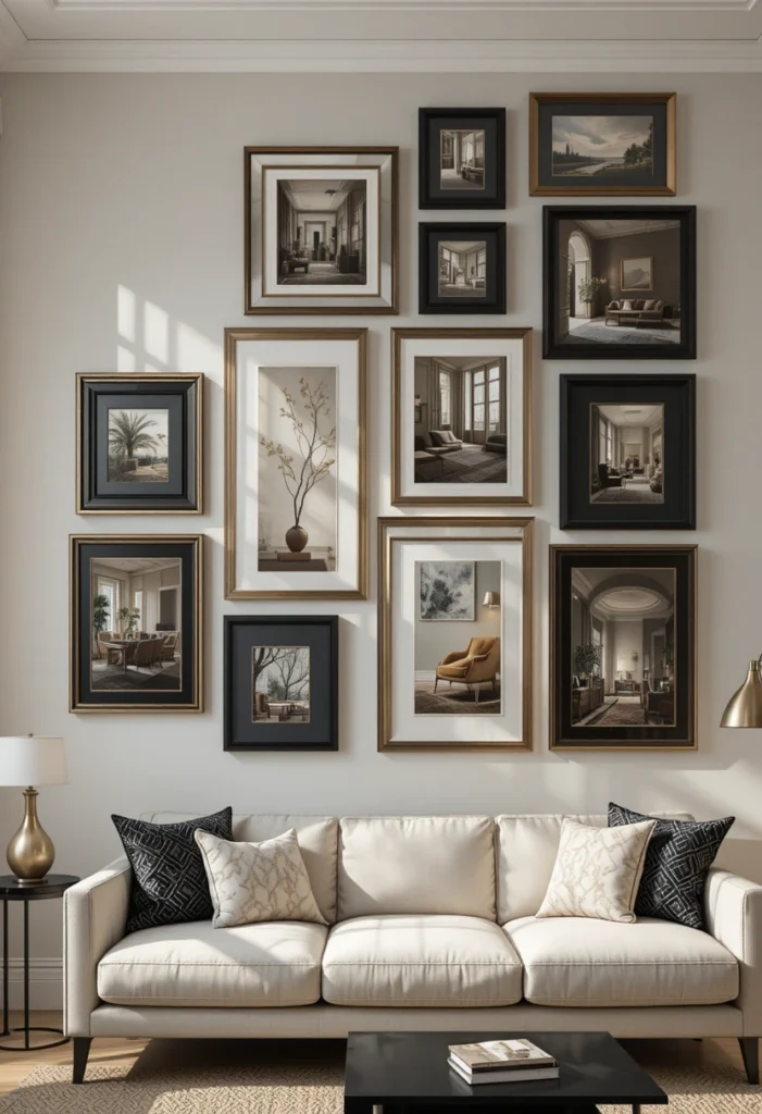
Frames step upward from lower-left to upper-right in a diagonal line, mimicking the rise of a staircase. It’s a striking option for living rooms with high or vaulted ceilings, where a flat horizontal layout would leave awkward empty space above.
- Space frames so the top corners align diagonally
- Keep frames the same size, or alternate between two sizes for rhythm
- Best for: tall walls, open-concept living rooms, spaces near an actual staircase
4. The Horizontal Row (Panoramic Layout)
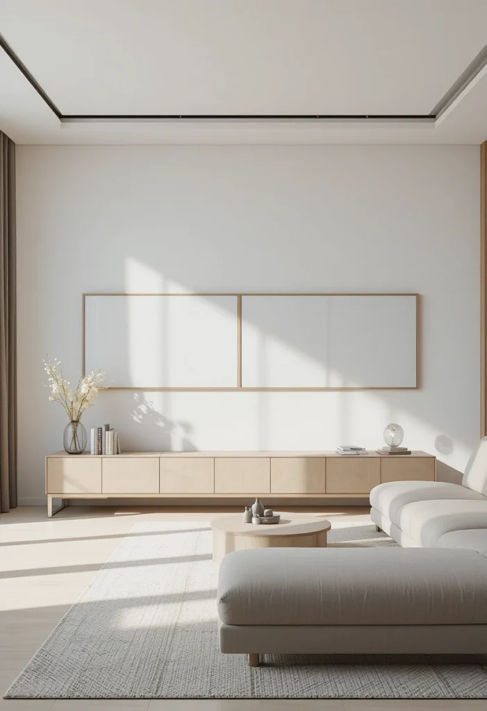
Three to five large prints, all the same size, hung in a single row at matching height. This layout mirrors the horizontal line of your sofa below, creating a wide, panoramic effect that feels calm rather than busy.
So what does this mean for your space? If you have a long, low sofa and a wide wall, this is one of the easiest layouts to get right on the first try there’s no complex spacing math, just one consistent height line.
- Best for: open-plan living rooms, long walls, low-profile sofas
- Caution: needs enough wall width to breathe three large frames on a short wall will feel cramped
Read Also: Nestly Home Deco
5. The Symmetrical (Mirror-Image) Layout
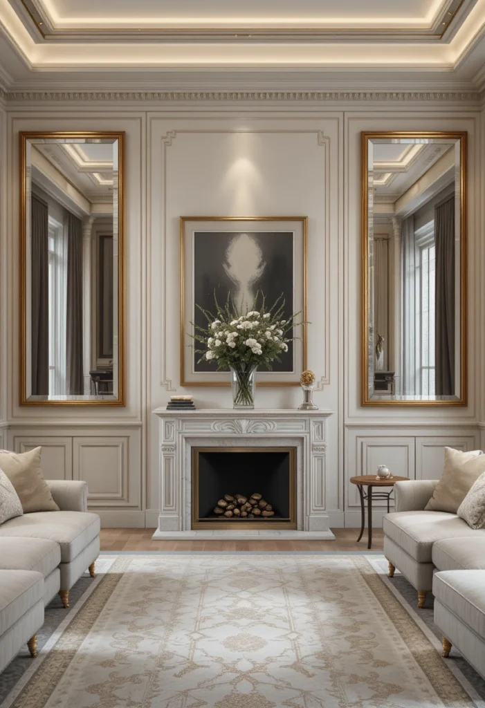
Pick a center point often a large piece of art, a mirror, or a shelf and arrange identical or matching frames in a mirrored pattern on either side.
- Best for: traditional, transitional, or formal living rooms
- Frame tip: Use identical frame sizes on each side of the center point for a polished, balanced look
- Works especially well flanking a fireplace or a window
6. The Asymmetrical Cluster
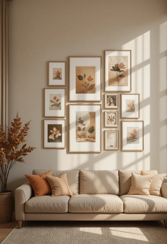
Unlike the grid, this layout embraces uneven spacing and mismatched frame sizes, but keeps a loose visual balance by weighting the composition evenly across the wall (not literally symmetrical, but balanced).
Quick tip: if it feels top-heavy or lopsided when you step back, it needs adjusting asymmetry should feel effortless, not off-balance.
- Best for: bohemian, coastal, or eclectic-modern spaces
- Frame tip: Vary sizes but keep spacing consistent (aim for around 3 inches between every piece) so the randomness feels intentional
7. The Large Anchor + Small Accents
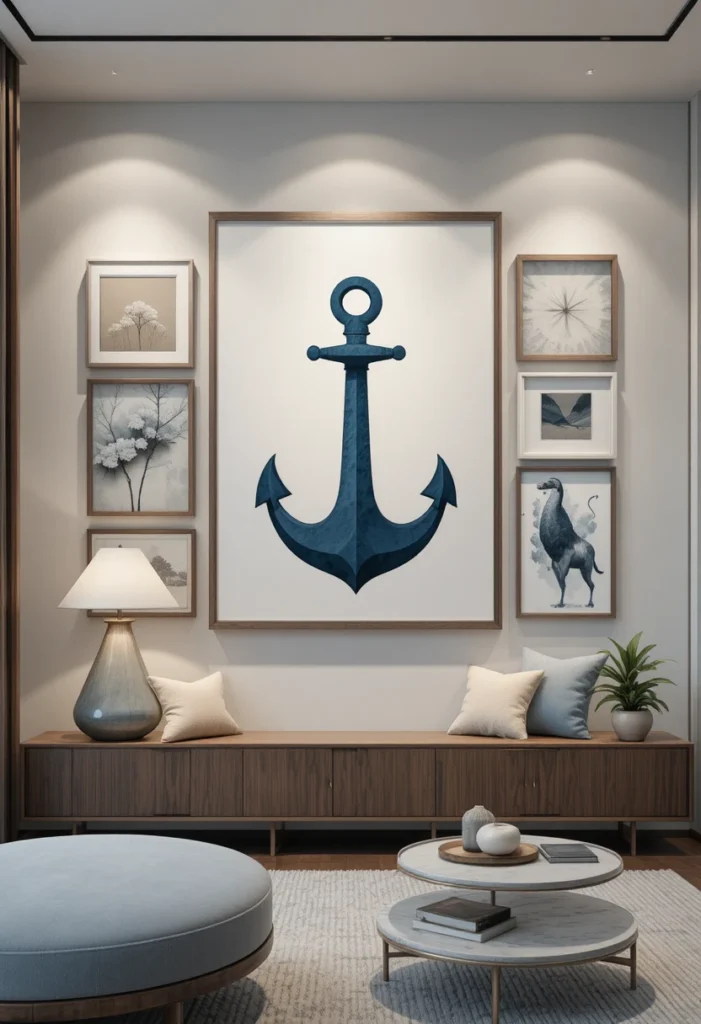
This is the layout most beginners skip and it’s the easiest fix for an awkward wall. Choose one oversized piece as your anchor (a large canvas, mirror, or statement print), then surround it with 3–6 smaller frames.
Here’s why it works so well: the large piece does the heavy lifting for visual impact, so you don’t need a dozen small frames to fill the space. It’s faster to hang, cheaper to source, and nearly impossible to get wrong.
- Best for: awkward or narrow walls, renters who want a quick, low-commitment update
- Frame tip: Keep the small accent frames in one consistent finish so they read as a set, not an afterthought
[Pinnable image placement: vertical shot of a large abstract canvas flanked by four small matching frames, overlay text “The Layout Lazy Decorators Swear By”]
8. The Shelf-Ledge Display
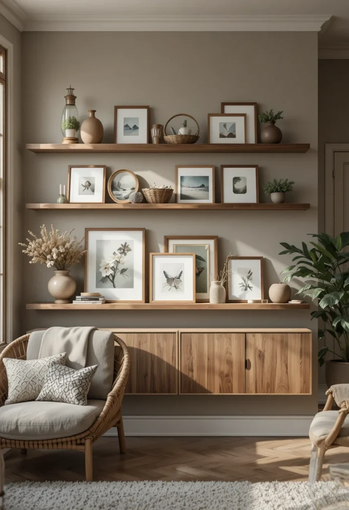
Skip the hammer entirely. Install one or two long floating picture ledges and lean your frames against the wall, layering smaller pieces in front of larger ones.
- Best for: renters, frequent redecorators, anyone who wants to swap art seasonally
- Styling tip: Layer 2–3 frames per cluster with the largest piece in back, and lean a plant or small object in front for texture
This is one of the most save-worthy layouts on this list because it’s endlessly changeable no new nail holes required every time your style shifts.
9. The Monochromatic (Color-Story) Wall
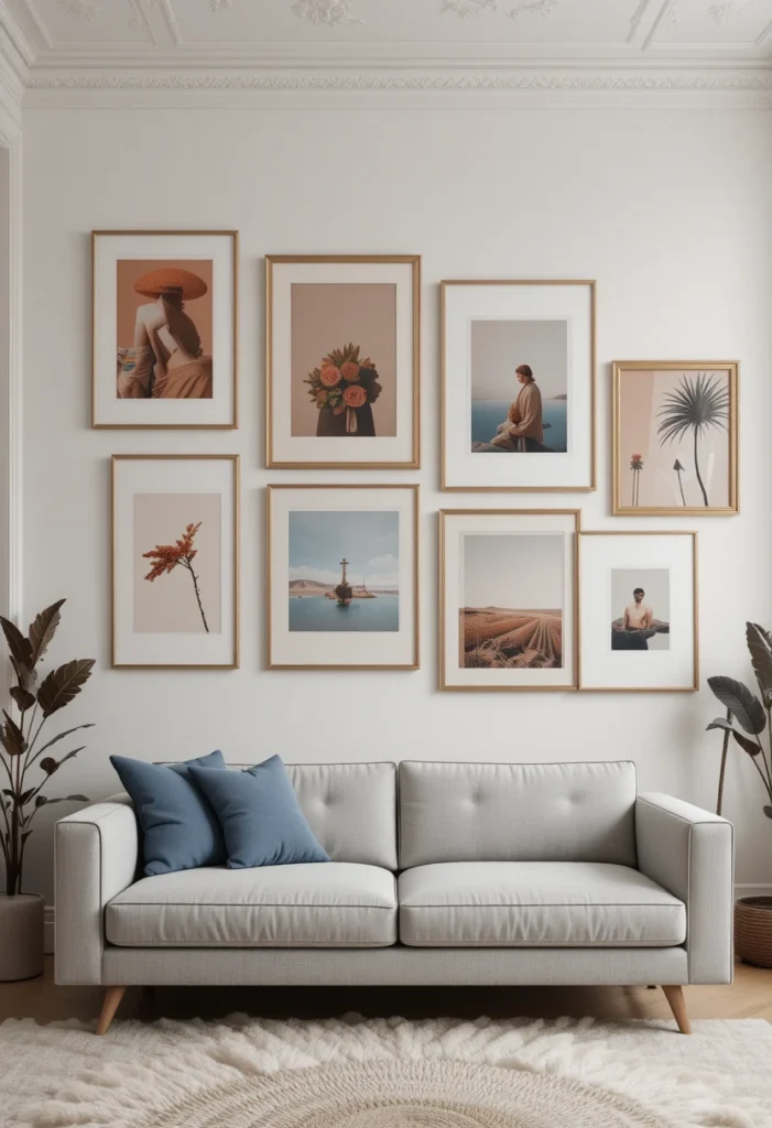
Every frame, every piece of art, and even the wall itself share one tonal family think all-white frames with black-and-white photography, or warm wood frames with sepia-toned prints.
Why this earns its spot: color is usually the biggest source of visual tension in a mixed gallery wall. Remove color variation entirely, and portraits, landscapes, and abstract pieces can all coexist without competing for attention.
- Best for: white or off-white walls where you want an airy, calm feel
- Budget tip: black-and-white prints are widely available and inexpensive, making this one of the most affordable layouts to pull off
10. The Mixed-Media Wall
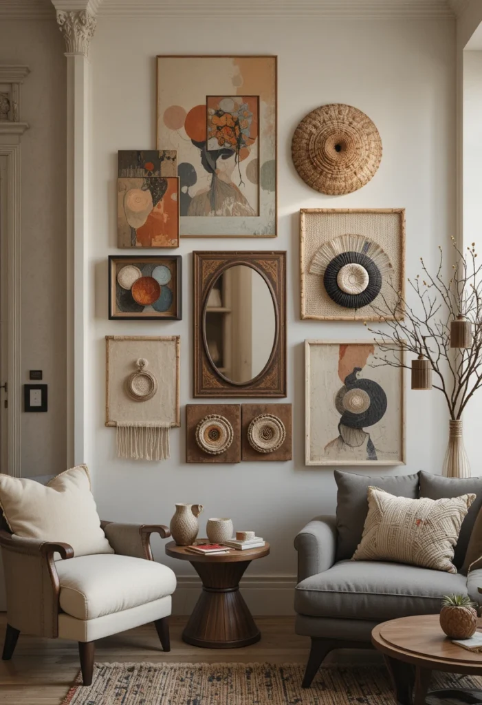
Combine framed art with mirrors, woven wall hangings, small shelves, and three-dimensional objects like carved wood pieces or ceramic wall art.
- Best for: living rooms that want texture and depth, not just flat images
- Layout tip: Treat the 3D pieces as your visual anchors and build framed art around them, rather than trying to fit everything into a rigid grid
11. The Vertical Column Layout
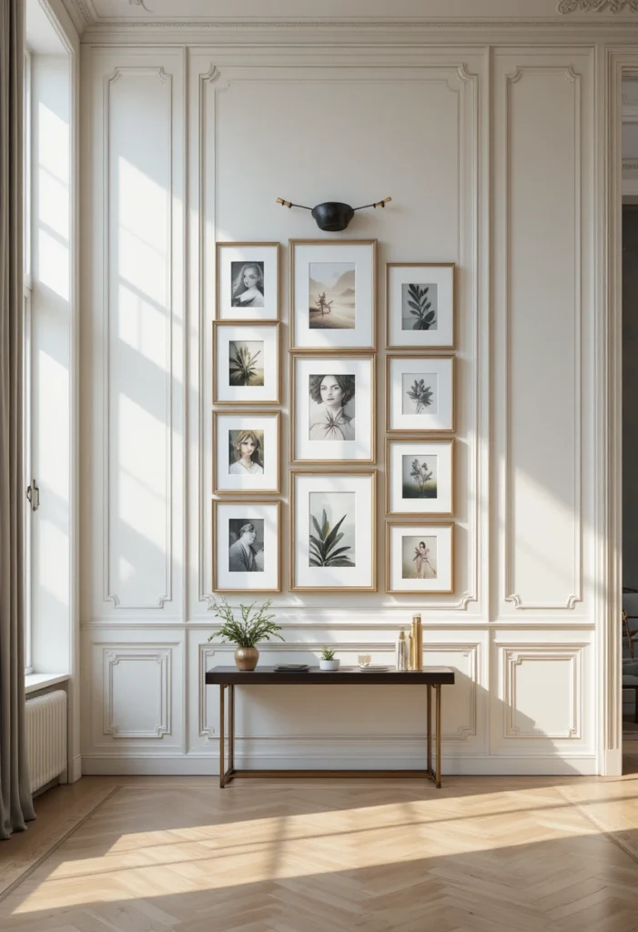
Narrow walls the kind squeezed between two doorways or beside a fireplace are notoriously hard to decorate because most layouts assume horizontal space. The solution: stack 3–5 frames in a single vertical column.
Bonus: a vertical column draws the eye upward, which makes ceilings feel taller a trick worth using even on walls that aren’t technically narrow.
- Best for: hallway-adjacent walls, spaces beside a fireplace, narrow accent walls
- Frame tip: Use a mixture of sizes from roughly 5×7 to 8×10 to keep the column visually interesting
12. The Circular (Oval) Cluster
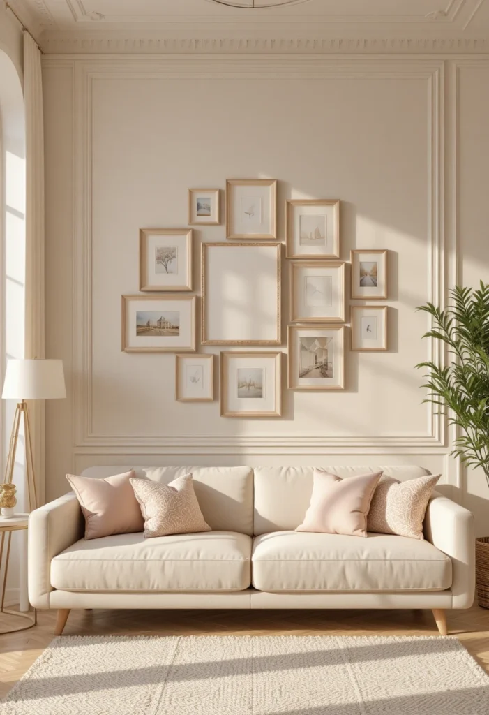
Frames are arranged in a loose circular or oval formation around a central point, rather than in straight rows. It softens a room full of hard-edged furniture and reads as more organic than a grid.
- Best for: rooms with a lot of straight lines and angular furniture that need a softer visual counterpoint
- Frame tip: Round or oval frames mixed into the cluster reinforce the circular shape and add extra polish
13. The Leaning Picture-Rail Look
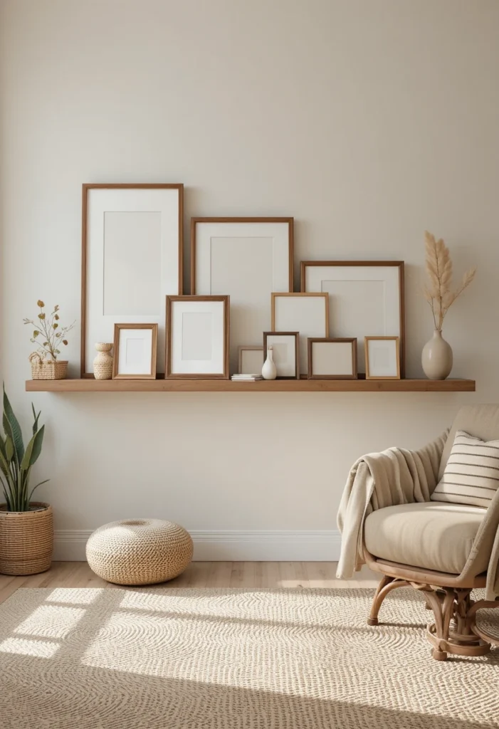
A single horizontal picture rail runs across the wall, and frames of varying heights hang from it at different lengths, creating a relaxed, gallery-museum feel.
- Best for: art-school-loft aesthetics, creative studios, or living rooms that want an editorial, “curated exhibit” vibe
- Styling tip: Vary the hanging length of each frame so the bottoms fall at different heights uniform bottoms defeat the purpose of this layout
14. The Family Photo Timeline
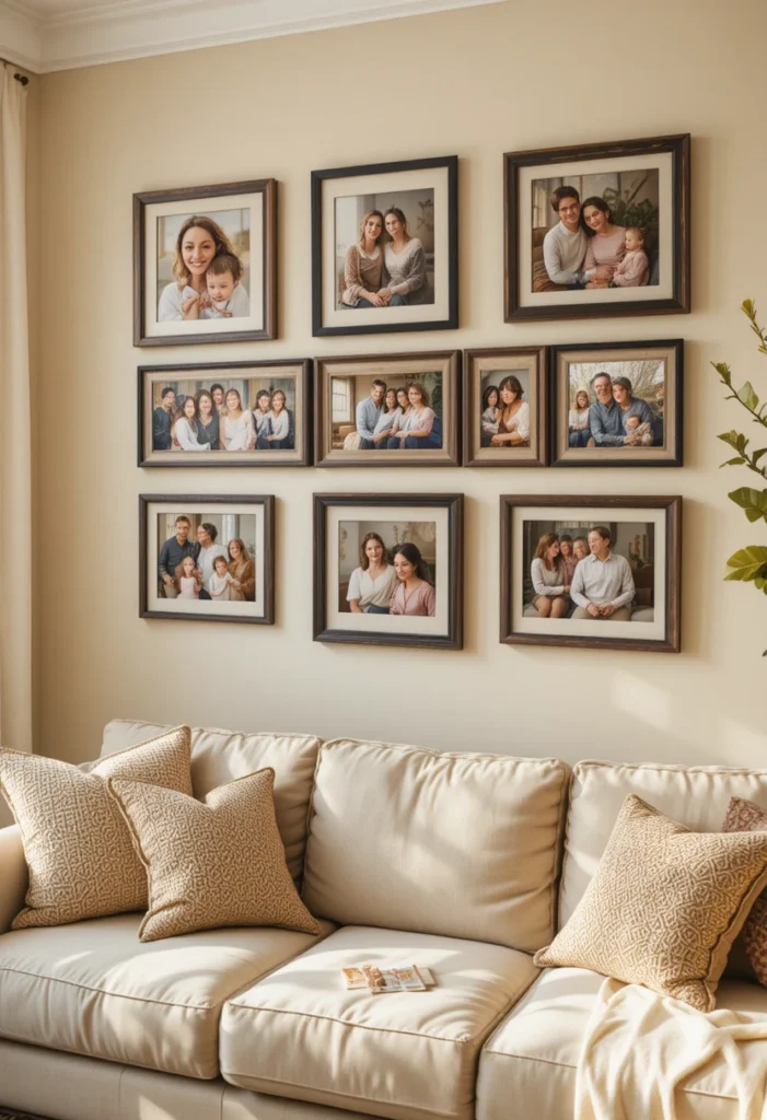
Arrange photos chronologically from left to right (or bottom to top), turning your gallery wall into a visual family story first apartment, wedding day, kids’ baby photos, right through to last year’s holiday card.
This is the layout people stop and read, which makes it one of the most personal, conversation-starting options on this list.
- Best for: family rooms, hallway-adjacent living spaces, homes that prioritize sentimental decor over strict design rules
- Frame tip: Use matching frames throughout so the timeline reads as one cohesive piece, not 15 separate photos
[Pinnable image placement: vertical shot of a chronological photo timeline in matching white frames, overlay text “Turn Your Photos Into Wall Art”]
The Universal Rules That Make Any Layout Work
No matter which of the 14 layouts you choose, a few ground rules apply across the board:
- Plan before you hang. Lay your frames on the floor first, or cut paper templates and tape them to the wall to test spacing without commitment.
- Keep spacing consistent. Around 2–3 inches between frames is the sweet spot for most layouts tighter reads as cluttered, wider reads as disconnected.
- Match frame breathing room to size. Larger frames look better with more space around them; smaller frames look best grouped closely.
- Step back often. Take a phone photo of your wall in progress it’s the fastest way to catch spacing issues your eye misses up close.
- Pick one unifying thread. Whether it’s color, frame finish, or subject matter, every successful layout on this list has one element tying it together.
Frequently Asked Questions
How do I plan a gallery wall layout without making extra nail holes?
Lay the arrangement out on the floor first, or trace each frame onto kraft paper and tape the templates to the wall. Mark the nail points through the paper, then tear it away once the frames are up.
What’s the best gallery wall layout for a small living room?
The vertical column layout (#11) or the large anchor with small accents (#7) both work well in tight spaces since they don’t require much horizontal wall width to look intentional.
How many frames do I need for a gallery wall?
It depends on the layout grid layouts typically use 6–12 matching frames, while a large anchor layout can look complete with just 4–6 pieces total.
Should all my frames match?
No, but they should share at least one common element color, finish, or size so the arrangement feels curated rather than random.
What height should a gallery wall start at above a sofa?
Most designers recommend starting the lowest frame roughly 6–8 inches above the top of the sofa back, keeping the overall arrangement centered on eye level when seated.
Bring Your Gallery Wall to Life
The right layout turns a blank, forgettable wall into the focal point of your entire living room and now you’ve got 14 different ways to do it, whether you’re working with a matching frame set or a thrifted, mismatched collection. Start with the layout that matches your wall shape and your existing decor, test it on the floor first, and don’t be afraid to adjust as you go.
Pin this guide so you have all 14 layouts on hand when you’re ready to start hanging.